
Shop Microplastic-free with DeMP
My Role
UX Designer,
Developer (ongoing)
Tool
Figma,
JS
UX Designer,
Developer (ongoing)
Tool
Figma,
JS
Timeline
12 weeks,
Individual project
Deliverables
User-flow + Stories, Wireframe , Hi-fi Prototype, Animations
12 weeks,
Individual project
Deliverables
User-flow + Stories, Wireframe , Hi-fi Prototype, Animations
Do you have any idea of what this backgroud picture captured?

The answer is Microplastic. Did you guess the right answer?
The image above is Microplastic filtered from a single bottle of water which took by Orb media, and it is not the milky way.
Background
What is Microplastic?
Microplastic is the plastic piece with less than 5 millimeters diameter,
which is about the size of a sesame seed and difficult to be captured by our naked eyes.
Today, over 5.25 trillion macro and micro pieces of plastic are existing in our ocean and 46,000 pieces in every square mile of the ocean (source). Unlike normal plastic pollution, microplastic is more difficult to be filtered from the water system and disposed properly, and it will keep accumulating in humans and animals’ body which might cause health issues in the short future.
PROBLEM
Do you know
microplastic’s existence in personal care products and cosmetics?
33%
of surveyed people heard about microplastic
10%
of surveyed people know microplastic’s existence in personal care products and cosmetics
︎ People have fairly low awareness of microplastic and don't have sufficient knowledge of it, but microplastic will be there and hurt us one day in the future.
OPPORTUNITY
There is no tool (app/extension) or effecient way could assist people in recognizing microplastic-free products during shopping in the current market.
Thus, how might we build a tool to help people distinguish microplastic-free products?
RESEARCH
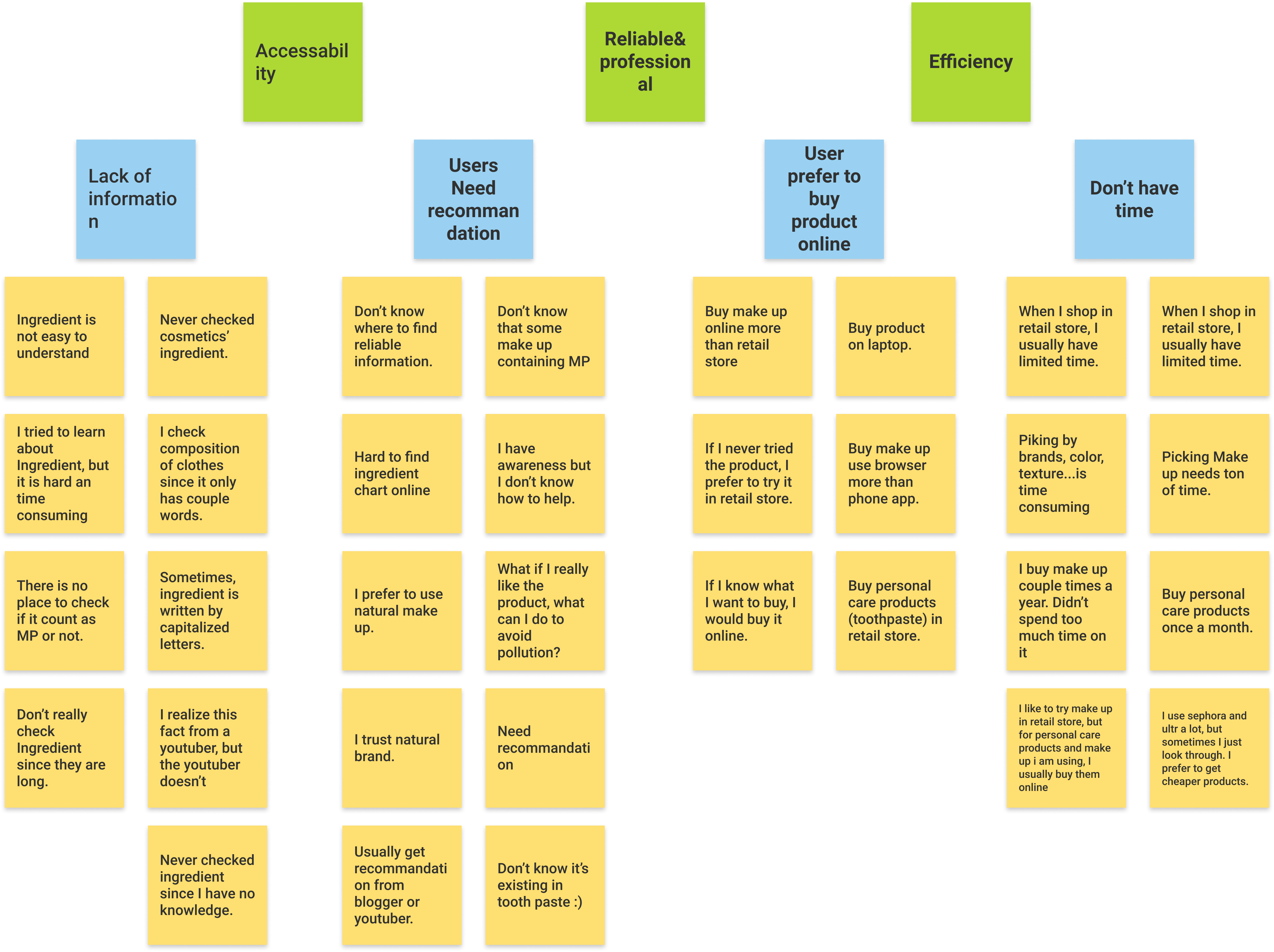
In order to fully understand the problem, we conducted an interview with 15 users who not only shop cosmetics & personal care products online often but also have awareness about environmental protection. Later on, I synthesized current user flow with key insights.
AFFINITY DIAGRAM

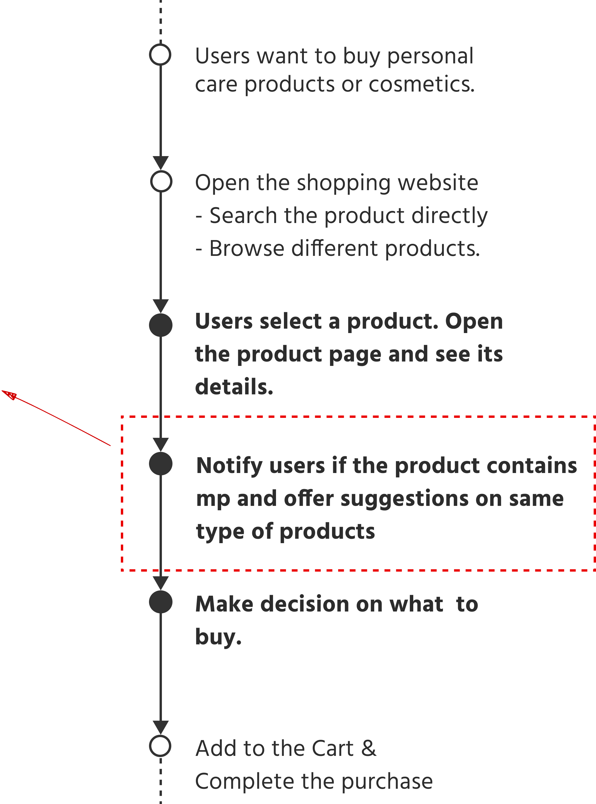
CURRENT USER FLOW
![]()

Because of the complexity of this process,
people barely act even they realize the severity of the consequence.
people barely act even they realize the severity of the consequence.
IDEAL USER FLOW
1. Provide a seamless experience
- Users’ shopping journey won’t be disrupted.2. Bridge the information gap
- Terms in the ingredient chart will be defined properly.3. Help develop a healthy lifestyle
- When users shop cosmetics, a list of same type of microplastic-free products will be ready to check.In this case, I would like to focus on optimizing the experience for US foremost prestige online beauty retailer Sephora.com, and the extension will be developed on Chrome platform.
EARLY STAGE CONCEPT
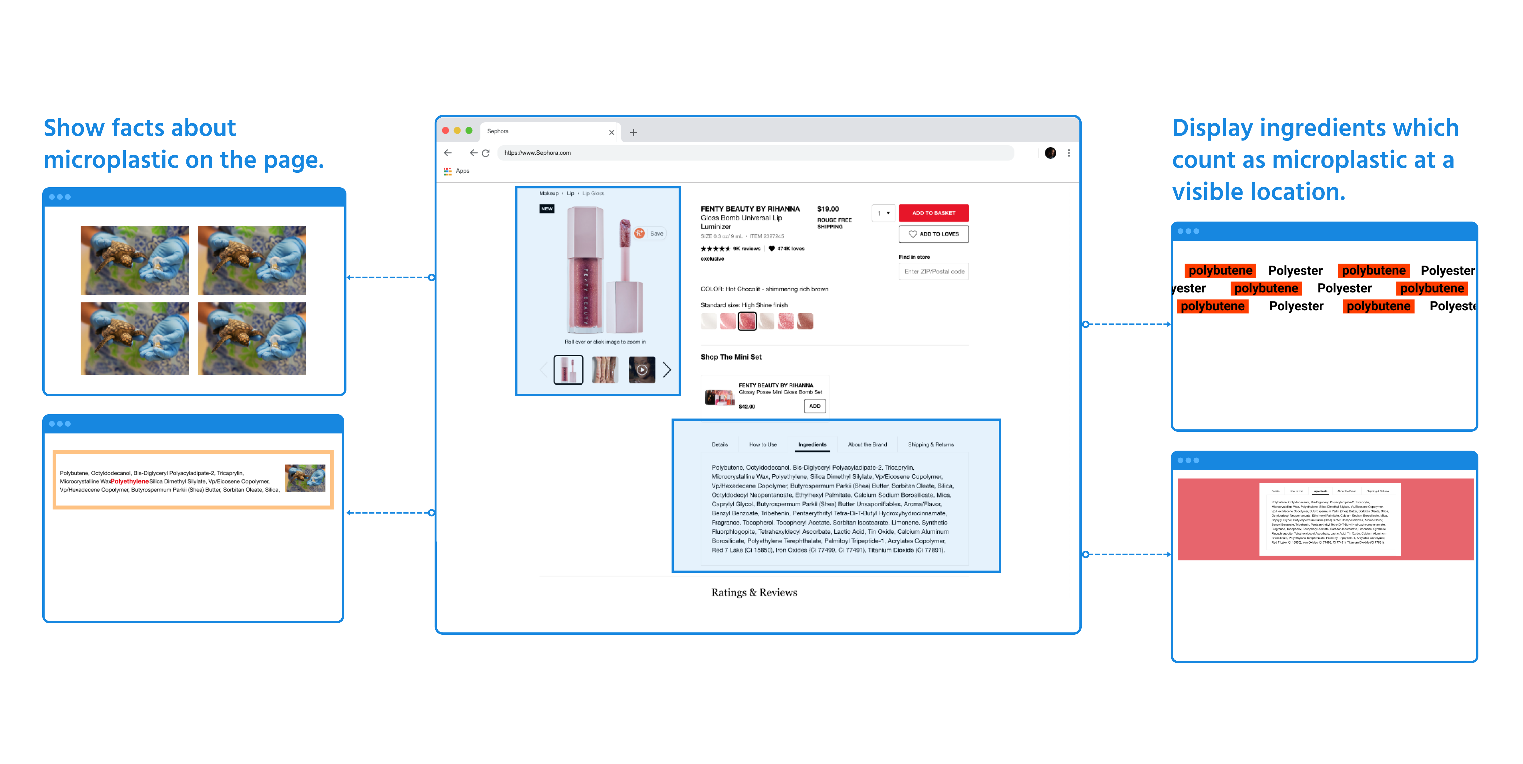
I brainstormed with method Crazy 8 to explore and push beyond my first idea since extension has a variety of choices on building a unique browsing experience. In the end, all my rough ideas can be summerize in these two directions: Visual and Informational.
Visual
Warn user with facts of microplastic by visualizing related information and picture on the shopping website with . Meanwhile, attract user‘s attention on product’s ingredient/composition which they might miss while they are browsing by changing the layout(css) of the website.User test (33% interviewees like this design)
Pro: “You can’t ignore it”, “It will raise my awareness. When I see these reminds repeatly, buying microplstic-free product might becomes my habit on day”.
Con: “Some of them might look like Ads”, “If it appears too much time, I might turn it off”
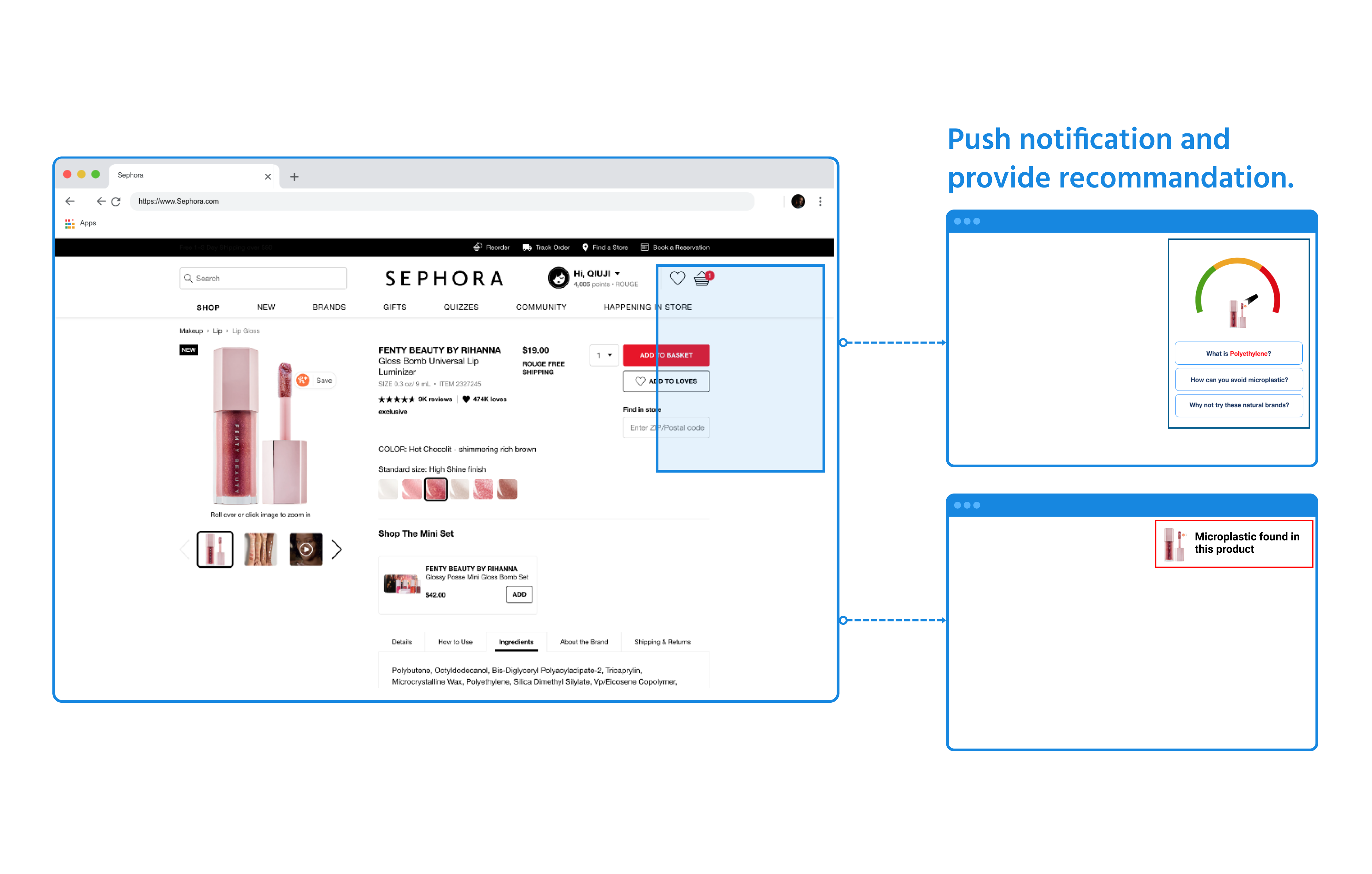
Informational ︎
Notify user if the product contains microbeads. If yes, offer more detailed information and recommandations with pop-up window.User test: (80% interviewees prefer this one)
Pro: “Information is condensed and straightforward which give me clear dirction of what I could do”, “It wouldn't disrupt my shopping experience to much”, “I like the recommandation part since it will save my time”.
Con: “Prioritize the information you want to show in this small window, such as the explanation of microplastic, the suggestions on products...”
WIREFRAME (Mid-Fidelity)
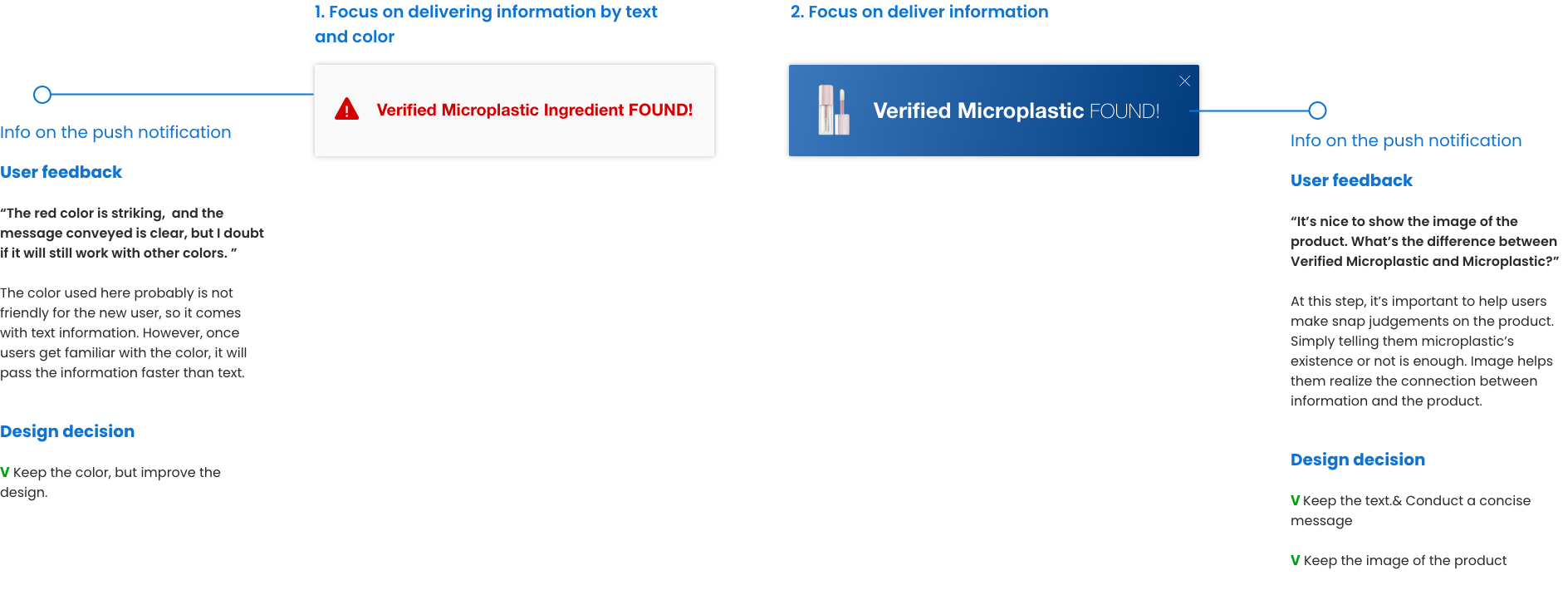
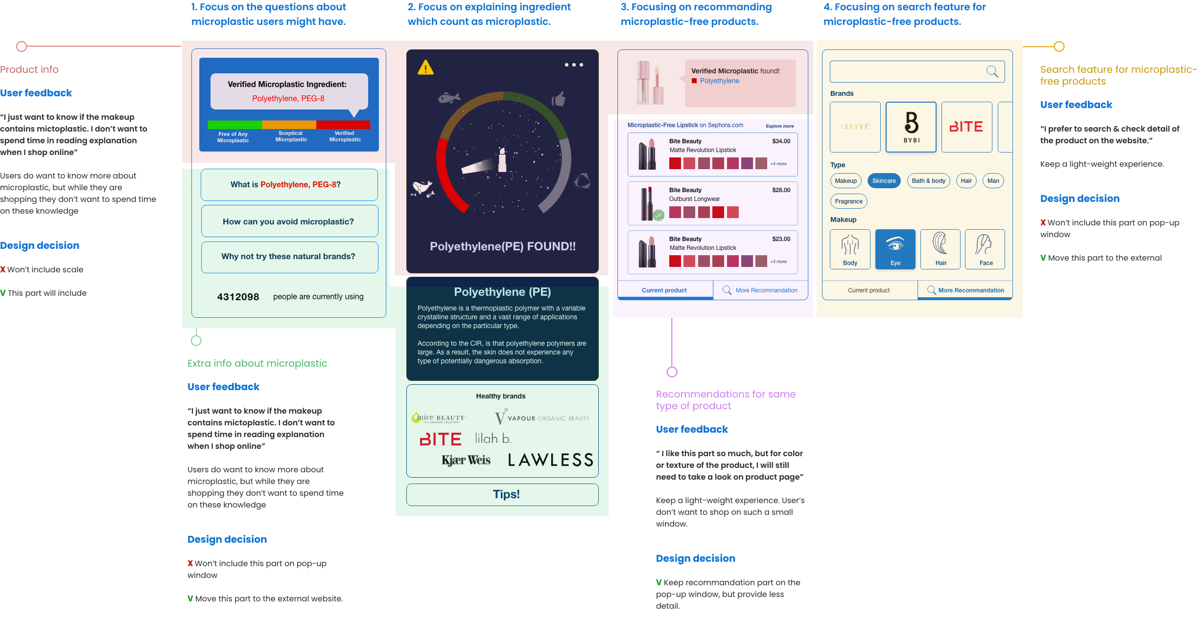
According to the feedback, I developed these two wireframes for push notification and four wireframes for a pop-up window ( Extension has fewer screens than phone or web app so I put more effort into design). These prototypes all have different priorities.
Push Notification
Pop-up Window
Fi
FINAL SOLUTIONS
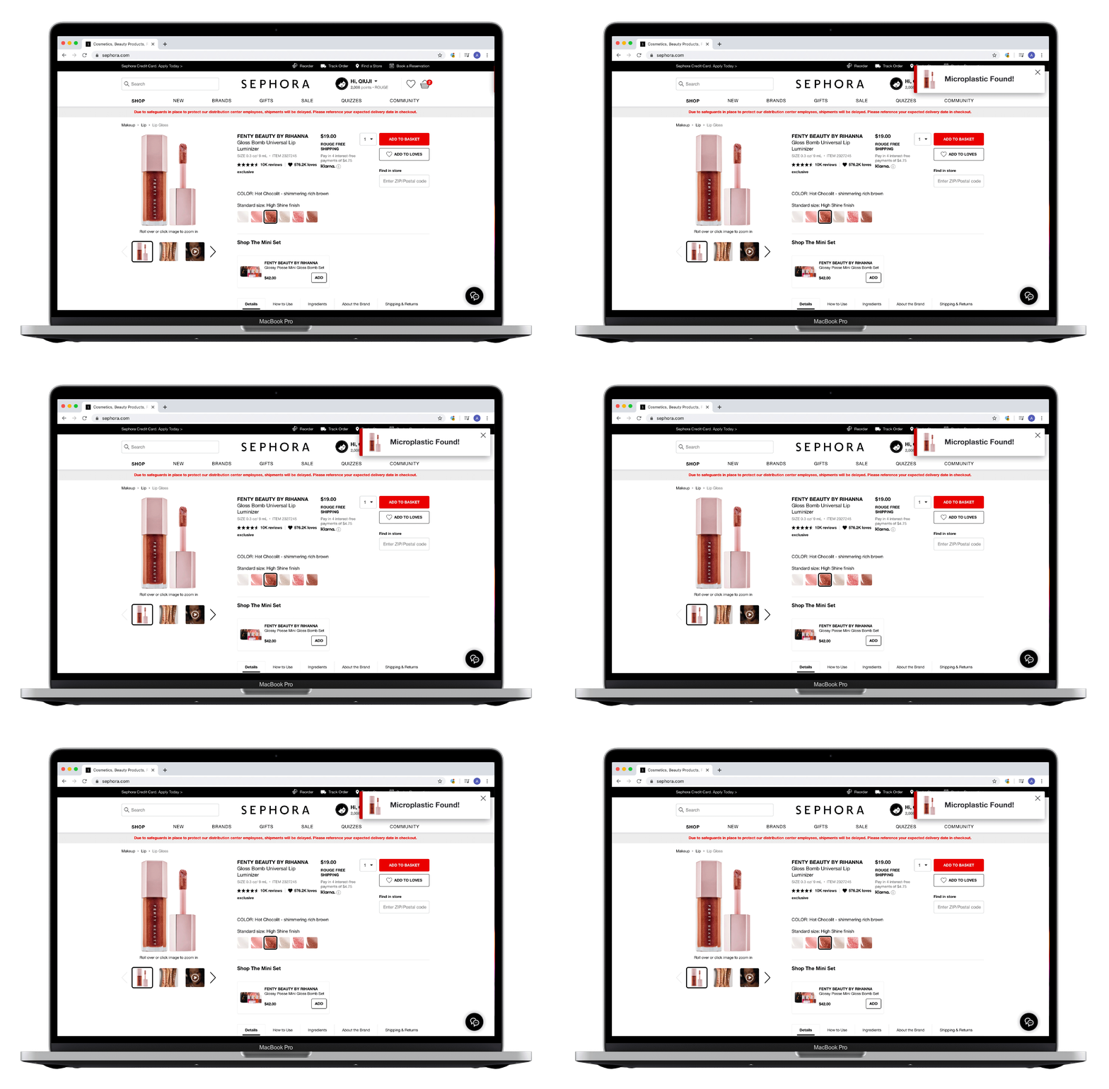
1. Automatic Push Notification.

Users will be notified with this short message instantly if the products contain microplastic, and it will save their time in browsing products.
2. Manually opened pop-up window.

When users want to know more details and recommendations, click the icon on the extension toolbar.

Promotional Video
Looking Back& Running Forward!
This is my first project which started with diving into a social issue. It is a fun experience which not only pushes my professional skills further but also pushes me rethinking my role as a UX designer and resident of the earth.
Next step: I am also designing an external website for DeMP which helps explain more details of microplastic. Meanwhile, I have already finished the front end part of DeMP, and I will keep developing the backend part. Hope it could be finished pretty soon.
Next step: I am also designing an external website for DeMP which helps explain more details of microplastic. Meanwhile, I have already finished the front end part of DeMP, and I will keep developing the backend part. Hope it could be finished pretty soon.